I recall when I taught project management. Every time I got to the planning chart (the Gantt 😊) and we talked about project real time as compared to the wonderful plans, I would say that a project manager spends most of their time waiting. They wait for people to do what they’ve promised, they wait for organisations to go through changes so that they can do what they signed up to do, they wait for committees to cancel their meetings, reschedule, get the right people in the room and make the decision they promised to do. They wait for what doesn’t work, then wait for the time it takes to learn, restructure and try again. Waiting. The planning is the easy bit. The planning, adjusting, waiting, reflection and trying again can seem endless.
I wrote all of that because it’s an easy model. Not everything is so easy to see. I reflect, this NAIDOC week when we focus on our First Nations peoples in Australia, that First Nations people in every settler invaded country wait for the broken treaties (if they exist) to be adjusted, restructured and tried again. The citizens of every country wait for elected politicians (if voting is allowed), to do what they’ve promised, then, often, they wait for corruption to appear, then wait for accountability to come out tops. We may wait for test results, medical reports, outcomes of applications, letters or emails in response. Wait. It seems to be the prevailing human condition – a permanent state if impermanency.
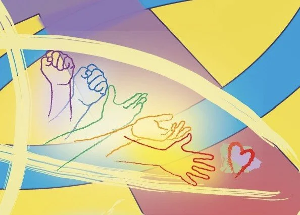
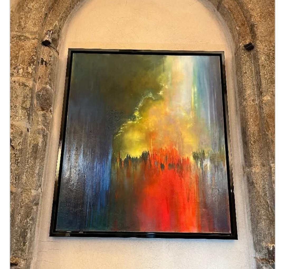
What to do? The image below is a section of the artwork I was commissioned to do for the United Reformed Church 2023 General Assembly. The section has closed hands, slowly opening toward love. When we wait, we can feel like that closed hand, often angry at the time we see slipping away. I wish you energy in the middle of whatever you wait for, to cherish the waiting time. It’s a gift of time to lay aside what we planned to do, now out of our control, and pick up something we can control. Something which gives us peace or joy. Something which helps us love. Something which helps us change our expectations and make creative decisions. Hopeful loving energy to you.